
A printer wants vector, the sign maker wants an outlined PDF and the web developer wants SVG. What each logo file is for, where it goes, and the files a proper logo pack should contain.
On this page
Many businesses we meet have a folder called "Logo" holding logo-final.png, logo-final-2.jpg and a PDF that opens strangely. Then the printer asks for vector, the signage company for an outlined PDF and the website developer for SVG. None of them is being difficult. They want files that should have come with the logo.
Here is what common logo file formats are for, where each file goes, and what a complete logo pack contains.
Vector and raster, simply
A raster image is a grid of pixels. PNG, JPG and WebP are raster formats, so a raster logo has a fixed size: enlarge it and the edges go soft and blocky. A vector logo is a set of shapes described by points and curves, so it redraws sharply at any size, from a business card to a building. SVG, PDF, EPS and AI files can all hold vector artwork.
The extension proves nothing. A PDF can contain a picture of the logo, and then its quality depends on that embedded image (Library of Congress, PDF family). Open the file and zoom in as far as it goes: crisp edges mean vector, little squares mean a picture of the logo.
What each format is for
- AI is Adobe Illustrator's working file, the master a designer edits. Editing it properly needs Illustrator.
- EPS is an older vector format Adobe developed in the late 1980s for placing artwork in print documents (Library of Congress, EPS). Some printers and sign makers still ask for it. Browsers cannot display it.
- PDF is what most printers want. PDF/X, a family of ISO standards for print exchange, requires fonts and images to be embedded (Library of Congress, PDF/X); if a printer names a version, the designer can export it.
- SVG is vector for the web, ideal, in MDN's words, for images "which can be accurately drawn at any size" (MDN, Image file type and format guide).
- PNG is lossless raster with transparency, which MDN calls the fallback "for any image needing transparency, as JPEG has no alpha channel". Use it in documents and slides.
- JPG has no transparency, so a JPG logo brings its own background, usually a white box, onto anything coloured. Keep it for photographs.
- WebP is a web format whose lossless and lossy modes both support transparency, at smaller sizes than PNG (Google for Developers, WebP). Good for a website; not a master, and not for email.
Colour: why the logo looks different on paper
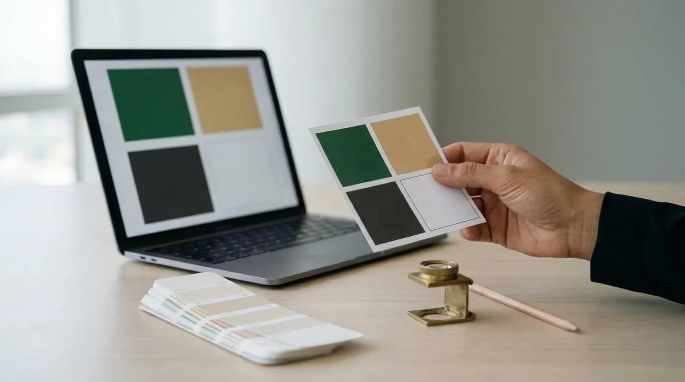
Screens mix red, green and blue light; most printers use cyan, magenta, yellow and black ink, and Vistaprint warns that a design left in RGB "may shift when converted for print" (Vistaprint, Prepress checklist). So a brand colour needs several values:
- RGB and hex for screens: website, social media, presentations.
- CMYK for everyday printing: cards, brochures, letterheads.
- A Pantone spot colour, a premixed ink rather than a mix of four process inks, where the colour must hold: signage, packaging, merchandise.
Pantone's Formula Guide shows spot colours on coated and uncoated paper, so you can see how each "will actually appear" (Pantone, Formula Guide), and its Color Bridge pairs spot colours with their "closest" CMYK matches, plus RGB and HTML values (Pantone, Color Bridge Guide). Closest is the honest word. A screen gives off light, paper reflects it, and both vary, so a logo never looks identical everywhere. The aim is values chosen together and checked on a printed proof; see a brand identity that survives its first year.
What a proper logo pack contains
Lockups. Horizontal for website headers and letterheads, stacked for squarer spaces, and the icon or symbol alone for favicons, profile pictures and anywhere the full name will not fit.
Colour versions. Full colour; one colour, usually black, for single-ink printing and engraving; and reversed, in white, for dark backgrounds and photographs.
Languages. In the UAE, usually English, Arabic and bilingual lockups, with the two scripts designed to sit together rather than one typed beside the other. In Dubai this is not only taste: under the Outdoor Advertising Manual, which the Department of Economy and Tourism applies, shopfront trade-name signs must be horizontal, "with Arabic positioned above English" (Government of Dubai Media Office, May 2026). Elsewhere, ask the authority that licenses the shop.
Clear space and minimum size. The empty margin around the logo, usually measured with a part of the logo itself, and the smallest size it may appear at, in millimetres for print and pixels for screens. Below that, use the icon.
Where each file goes
The website
On SVG vs PNG, the website takes both: SVG for the header logo, PNG where SVG is not accepted, and a square icon for the favicon. Google asks for a square favicon at least 8 by 8 pixels, recommends one larger than 48 by 48, and, as of November 2026, lists the formats Search supports: BMP, GIF, ICO, PNG, JPEG, PPM and TIFF (Google Search Central, Favicon). SVG is not among them, so supply a PNG favicon too. A logo in Organization structured data must be at least 112 by 112 pixels and should look right "on a purely white background" (Google Search Central, Organization), which rules out the white version. More in image SEO for business websites.
Social profile pictures
Use the icon, centred on a solid square with generous margins. Facebook says a Page profile picture "is cropped to a circle" and should be 320 by 320 pixels for best quality (Facebook Help Centre). LinkedIn recommends 400 by 400 for a Page logo, which is "displayed on both light and dark backgrounds", and shows a transparent logo on white (LinkedIn Help). Other platforms differ, so preview before publishing. A horizontal lockup squeezed into a circle is unreadable.
The printer
Send a vector PDF in CMYK or Pantone colour, with text converted to outlines (some programs say curves): each letter becomes a shape that looks the same but "cannot be edited" as text (Corel, Find, edit and convert text), so the printer no longer needs your font. Vistaprint lists fonts not embedded, outlined or packaged, RGB colour and missing bleed among common prepress red flags. Bleed belongs to the finished artwork, not the logo file: background extended past the cut line, "commonly" 3 mm, so a slightly off cut leaves no white edge (Vistaprint, Crop marks explained). Ask for each printer's specification.
Signage, embroidery and merchandise
Sign makers cut vinyl, route acrylic and form letters from vector paths, so we send them outlined vector files and the Pantone references. An embroiderer converts the logo into a stitch file, and fine lines and small text may not survive thread, which is where the icon and one-colour versions earn their place. For merchandise, ask the supplier which file and colour reference they want.
Email signatures
Use a small PNG. In Can I email's tests (last run: PNG 2020, WebP 2021, SVG September 2026), PNG works across the major clients, but the Outlook for Windows versions tested do not show WebP, and those before Outlook 2019 do not show SVG. Microsoft says classic Outlook blocks automatic picture downloads by default (Microsoft Support), so keep your name, company and phone number as text.
Housekeeping
- Name files so they explain themselves: company-logo-horizontal-colour.svg, company-logo-icon-white.png, company-logo-stacked-black-cmyk.pdf. Lower case, hyphens, no "final-v3".
- Keep one shared folder with masters, web and print subfolders, and send suppliers a link rather than an old attachment.
- Ask whoever designed the logo for the master files (AI or vector PDF) and the names and licences of the fonts, while they are easy to reach. A font licence may cover the designer's computer but not your staff's machines or your website.
- A PNG saved from the website is not a logo pack. It is one size, in screen colours, often compressed. Enlarged for a sign or a vehicle it blurs, and the printer has to guess the colours. A designer can redraw it, but that is a job in itself.
The checklist: what logo files you need
- Vector masters (AI and PDF, plus EPS if a supplier asks) of the horizontal, stacked and icon lockups.
- SVG of each lockup for the website.
- PNG with transparency in full colour, black and white, at a few sizes.
- A square icon for the favicon and social profiles, with a solid-background version.
- English, Arabic and bilingual lockups.
- Colour values: hex and RGB, CMYK, and Pantone for coated and uncoated paper.
- Clear space and minimum size, on a one-page guideline.
- Font names and licences.
- One shared, consistently named folder.
When we design or refresh an identity, this pack is part of the handover, so the next printer, developer or sign maker gets the right file first time.
Sources
- Vistaprint, Prepress checklist and Crop marks explained: prepress and bleed.
- Library of Congress, PDF, EPS and PDF/X format descriptions.
- MDN, Image file type and format guide: SVG, PNG, JPEG.
- Google for Developers, WebP: transparency and file sizes.
- Pantone, Formula Guide and Color Bridge Guide: spot colours and their equivalents.
- Government of Dubai Media Office, May 2026: shopfront sign language rules.
- Google Search Central, Favicon and Organization structured data: favicon and logo requirements.
- Facebook Help Centre, Page profile picture dimensions and LinkedIn Help, Page image specifications: profile images.
- Corel, Find, edit and convert text: converting text to curves.
- Can I email, SVG, WebP, PNG and Microsoft Support, classic Outlook pictures: images in email.
- logo design
- vector logo
- file formats
- brand identity
- printing
- UAE